Overview
I've been collecting words since high school and I have never once gone back and read the list. It lives in a note on my phone. Every so often I hear a good one, something like petrichor or sonder, I tap it in, feel briefly clever and then it sits there with the other two hundred and I never look at it again. The words I actually own are the ones that turned up in the middle of my day, in something I was reading anyway, at a moment when I had room for them. Not the ones I filed away for later.
For a while I assumed someone must have already built the thing I wanted. One good word arriving on my phone in the morning, pitched at a level I'd actually find interesting, at a time I picked myself. Everything I found was either a dictionary app that wanted me to open it or a daily email I'd archive without reading. I didn't want another inbox. I wanted a nudge, once, at the right moment.
That's when it hit me. I'd just come off building Sydney Train Alerts and I had web push running end to end with no app anywhere in sight. Delivery was never going to be the hard part. The hard part is having something worth sending! So that's what I built. It's called word, daily., it's free, there's no account and it's live at wordaily.app.
What I built
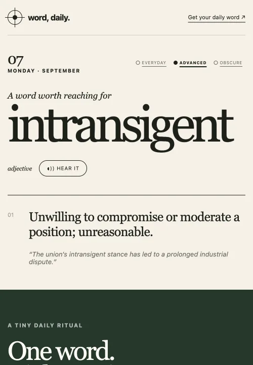
The whole site is one page you can read without signing up for anything and a form underneath it if you want the word to come to you.
- Three levels. Everyday is words you'll actually use, advanced is words worth reaching for and obscure is the ones most people have never met. You tap between them on the homepage and the card swaps straight away.
- The word card gives you the word, its part of speech, the dictionary definition and an example sentence, plus a HEAR IT button that speaks it in Australian English.
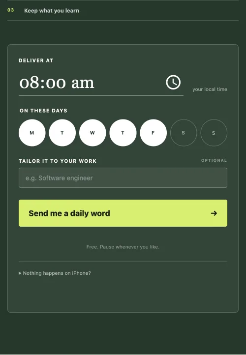
- Delivery on your terms. Pick the time, pick the days and it lands at that hour in your own timezone. No app to install, it's a browser push notification.
- A stream for your job. Type in what you do, it works out the closest field and then you choose how often a word from your work shows up instead of a general one. A nurse gets nursing vocabulary a third of the time if that's what they set.
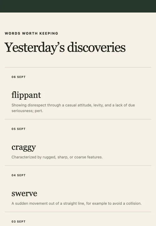
- An archive of everything the level has already sent, so a word you half remember from Tuesday is still there.
- A settings page on a link only you have, where you change the time, the days, the level and the career ratio. Or turn the whole thing off.
- A blog, five posts, mostly about why the words you look up never stick.
How it works
It's one Cloudflare Worker written in TypeScript with Hono on top. No client framework anywhere, the pages are server rendered HTML with a few hundred lines of vanilla JavaScript for the subscribe flow.
- Web push, written by hand. I ported the sending side across from Train Alerts, where I'd built it with WebCrypto instead of a library so I actually understood it. RFC 8292 signs a short JWT with an elliptic curve key so the push service knows who's knocking and RFC 8291 encrypts the payload to the subscription's own keys so nobody in the middle can read the notification, including the service carrying it.
- One Durable Object per subscriber. Each person's object holds a single durable alarm set to their next delivery. Nothing scans a table looking for who's due. The alarm fires, the object sends that person's word, works out the next matching time in their timezone and re-arms itself. It sleeps the rest of the day and costs nothing while it does.
- D1 is the source of truth. A Durable Object can lose its alarm. It's rare and it's recoverable, but if nothing notices then that subscriber goes quiet forever. So every subscription lives in D1 and an hourly cron walks it and re-arms anything whose alarm has gone missing. The object owns the schedule, the database owns the fact the subscription exists and either one rebuilds from the other.
- A shared word ledger, which is the actual economic model. One table keyed on field, level and day. Everyone who wants the same kind of word on the same morning reads the same row, so generation scales with the number of distinct streams rather than the number of people. The naive version, a word per subscriber per day, works out around $1,165 a year at ten thousand users for content that's largely identical.
- Nine days of buffer, not seven. Words are chosen about a week ahead. The buffer holds one day behind and seven ahead because subscribers span UTC minus eleven to UTC plus fourteen, which is twenty five hours of spread. There is always someone for whom it's already tomorrow.
- Datamuse picks the word, the model writes the sentence. More on that below, because it's the thing I got most wrong.
- Turnstile on the two routes that spend money. The career matcher reaches a model with no push permission standing behind it, so it's gated and rate limited. It also deliberately creates nothing. Only a completed subscribe can mint a new field. If a page visit could mint one then a script could mint ten thousand overnight and burn the neuron allowance while I slept.
Sticking points
Asking a model which words are rare
The first version had Workers AI choose the word, with eighteen hand-picked exemplars per level to anchor it. It worked most mornings. Then I opened the site and the obscure word of the day was clap, defined as a sudden loud noise.
So I wrote a denylist of common words. I audited the nine day buffer against it and it caught two duds out of about a dozen. Nostalgia sailed through, so did bewilderment, childish and enormous. Then I moved from an 8B model to a 70B one, which stopped the drift into words about words and still served blacksmith and dandy as obscure. Then I rewrote the prompt to stop it contradicting itself, which helped and still gave me sacrifice, talent and courage on advanced.
Three goes at the same wall before I actually looked at the framing. Difficulty isn't a language judgement at all. It's a corpus statistic and Datamuse hands it back as a number, free, with no API key. I ran my own seed lists through it and the three levels sat at medians of 2.76, 0.38 and 0.004 occurrences per million, roughly seven times and ninety times apart. That's a separation a model can't estimate and shouldn't have been asked to.
Two things the live dry runs taught after that. Aim at the median of the band and not at an edge, because the rarest word in a range gives you dead Wiktionary entries like ampelite and aporesis while the commonest gives you systematic and moderate. And obscure can't be found this way at all. It's an aesthetic rather than a frequency band. Petrichor and hiraeth are loanwords and coinages that happen to be rare and the rarity is a consequence of what makes them lovely rather than the cause of it. Searching the correct band returned minerality, shoosh and putrification, all properly rare and none of them worth waking up to. So obscure draws from a curated pool of 235 words I chose by hand and the dictionary still defines them. Only the choosing moved.
The model kept the one job it's genuinely good at, which is writing an example sentence for a word it's been handed.
Wiktionary carries the whole language
Swapping to a dictionary fixed difficulty and immediately opened a different problem. Wiktionary is complete, which includes all the parts nobody wants pushed to their phone over breakfast. A live dry run cheerfully offered bonerism as an obscure candidate.
What followed was a run of small, cheap checks that each came from one real bad word getting through. Entries labelled vulgar, slang, offensive or obsolete are refused. Definitions that only redirect somewhere else are refused, because spyre defined as an obsolete spelling of spire is a spelling note and not a word worth anyone's morning. Definitions that name a person are refused, after canny came back with exactly one sense, "A surname.". The model then dutifully wrote a sentence around it about a friend who is a canny.
My favourite one is the circular check. A live run shipped picaresque, defined as a picaresque novel. That is a completely correct dictionary entry and it teaches a reader nothing, which is the exact outcome the whole pipeline exists to avoid. The comparison runs on a stem rather than the whole word so inflections get caught too.
The really annoying part was that picaresque was already sitting in the production ledger by the time I found it and the app wouldn't let me fix it. Regenerating a day refuses anything at or before tomorrow, because a reader on UTC plus fourteen is already a day ahead of the server and a word someone has been sent must never change underneath them. That's the invariant working exactly as designed, which is not much comfort when it's your bad row on your live site. I deleted it from D1 instead so the pipeline regenerated that day properly, then swept the other 29 rows to check it was the only one.
The gate that hung forever
Once the site was live I ran a read only audit over the whole shipped surface in a real browser, which found something no local dev server ever would have. Tab out of the career field and the page printed "Finding the closest word stream" and then, sometimes, sat there forever. No request, no error, no timeout. Two hangs in four attempts.
It wasn't Turnstile. It was that render() gives you a widget id synchronously but mounts the widget asynchronously, so the execute() I fired in the same tick landed on a widget that didn't exist yet and got dropped in silence. A retry worked, because a retry takes the reset branch on a widget that's already mounted, which is exactly why it hung in half the attempts rather than all of them.
The worse half was the call site. I'd awaited that token inside the argument list of the fetch call, outside any try, so a rejection threw out of the listener as an unhandled rejection and left the same frozen message on screen. I'd written a perfectly good "Couldn't place that job" fallback and it was unreachable for every gate failure. It only ever covered a bad HTTP status. Both widgets now render at page load, the pending promise is assigned before execute so a fast token has somewhere to land. There's a backstop now too that gives up and tells you rather than spinning forever.
Same gate sits in front of the subscribe button, so the main thing I want people to do on the site could stick in exactly the same way, after they'd already granted a notification permission.
A transcription that was wrong in a way only the right readers would spot
Pronunciation had been null for every word since the switch to the dictionary, so I wired it up. Datamuse returns IPA and I put it beside the headword, backfilled the existing rows and moved on feeling good about it.
It was wrong. The transcription is a symbol for symbol conversion of CMU Arpabet. Arpabet marks stress on the vowel, so the stress mark came out mid cluster. Where a dictionary prints one thing my card printed something else. 34 of the 36 live rows were malformed that way. Six of them carried a rhotic r and twelve a dark l, which is General American, on a site whose HEAR IT button deliberately speaks Australian English.
Wiktionary's own API would have fixed the dialect and the stress together and I decided it wasn't worth it. HEAR IT already answers "how does this sound" for every reader, correctly and in the right accent. The IPA line was a second and worse answer that almost nobody reads. The readers who do read it are precisely the ones who'd notice it was wrong. So the line went. The pipeline still fetches and stores the pronunciation, which is exactly the setup where someone reinstates the line later because the data is right there, so the test for it got inverted rather than deleted to hold the door shut.
Nothing had ever looked at a pixel
This is the one I'd tell everyone about. Both PWA icons shipped as a single flat colour. 192 by 192 and 512 by 512 of exactly one purplish square with nothing drawn on them, so adding the site to an iOS home screen gave you a blank tile.
Every check that feature had ever had passed. The files existed. They were valid PNGs at the right dimensions. They were tracked in git, the head linked them correctly and production served them a 200. The plumbing was flawless in every direction and not one thing in the entire stack had ever looked at the image itself.
They're now the site's own mark, the little reticle from the header with its geometry taken straight from the CSS and scaled up, sitting inside the safe zone so the maskable declaration is honest. The new test decodes the served PNG and counts distinct colours, because a flat tile has exactly one and no amount of correct plumbing around it can raise that number. I checked it properly by restoring the broken icon and watching it fail.
The result
I'm chuffed with this one. It's about 4,000 lines of TypeScript across one Worker, one D1 database and a Durable Object per person, with 424 unit tests and a browser suite that both run on every push now. It costs me effectively nothing to run and it does the single thing I wanted, which is put a good word in front of me in the morning without asking me to open anything. My note full of words is still there and I still never read it. Now I don't need to.
It's live at wordaily.app, so pick a level and a time and it'll start turning up.
The thing I'd pass on to other engineers is the blank icon. Have a look at what your tests are actually asserting and count how many of them check that a thing was produced rather than checking the thing itself. Mine proved a file existed, had the right dimensions and got served with a 200, which is three assertions about plumbing and none about content. If your feature ends in an image, decode it. If it ends in a notification, decrypt what you sent and read it. If it ends in a page, measure the element. I'd run an audit over your live site in a real browser too, because a few of the problems above were only ever visible in production and would never have shown up on a local dev server. Happy coding!